Paint Colours: The Ultimate Guide (2022-2023)
Many homeowners already know that choosing new paint colours for any room in the house can be completely transformative. Painting is considered one of the easiest ways to make your home cleaner, brighter, and truly ‘yours.’
Painting can help you achieve any look you’re going for, whether you want a rustic kitchen, a modern bathroom, or a contemporary bedroom – a new coat of paint can do it all.
Although painting can be a relatively simple process, with so many colours, shades, and even brands to choose from, it can be a challenge to pick the right one for you and your home.
In our Ultimate Guide to paint colours (2022-2023), we’ll help guide you through the entire process, from brainstorming colour ideas for every room in the home, to choosing your perfect shade, to tips on perfectly painting your house!
So, grab your paintbrush and stir sticks – let’s get started!


Jump To:


Paint is all around you – whether you’re at home, at the office, in the movie theatre, retail store, restaurant, hotel, or any public space – someone has put effort into choosing the colour of the walls you see.
Many times, it goes unnoticed (often intentionally), and other times you may be shocked or surprised to see a bright yellow accent wall or a completely black room.
Painting does more than cover up imperfections on your walls; colours allows you to express yourself and your unique taste. It has the ability to transform a room, to convey emotion, and to help create a certain tone or feeling.
Take a look at the two contrasting bedrooms below. The one on the left is painted with a dark yet cozy colour; the one on the right is painted a light, airy colour. Both of these bedrooms are gorgeous – but there is no denying that they give off two very different looks and feels.
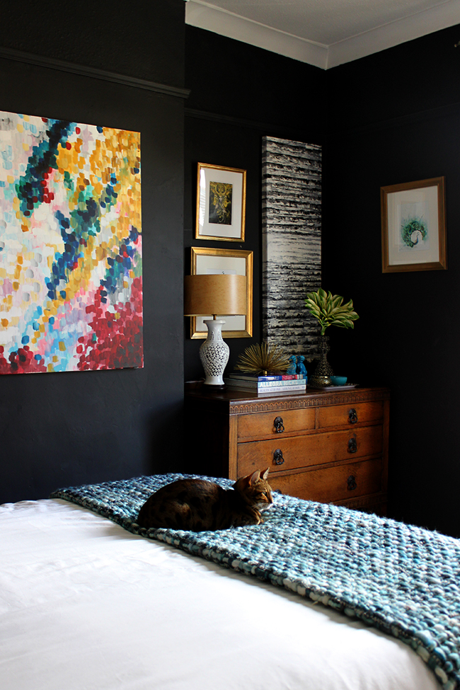
Image source: Swoonworthy.co.uk

Image source: homedeco.nl
Choosing new paint colours can be part of an entire room renovation or remodel, or it can refresh an existing room that you already love (most of) the look of.
Over the last few years, we’ve seen an increase in popularity for an accent wall – that is, one wall that is painted a brighter or darker colour than the rest of the room. Accent walls are a great way to add a pop of colour or try a less traditional colour without overwhelming your senses.
When choosing accent colours as well as colours that you can see from various rooms in the house (for example, your kitchen wall colour and your living room wall colour), you will want to ensure that these colours do not clash.
In Chapter 3, we’ll go over how to choose the right colours for you, and in Chapter 4, we’ll outline some ways that you can ensure you not only tolerate your paint colours, but LOVE them!
However, before we get to that, we’ll take a look at what the most popular colours are in 2022. Remember, you can always choose to go against the grain and pick whatever colours you love – however, taking a look at popular paint colours now will help you get a good idea of what other people and experts like right now – and why.

Paint colours come and go (and they usually come around again), but when they’re in – they are usually in for quite a while. Otherwise, it would get tiresome repainting your entire home every year!
The colours listed below are trending in 2022 – but if you take a closer look over the last few decades, you will realize that this is not the first time most of these colours have been in the spotlight.
To start off our most popular colours list, let’s take a look at Pantone’s® Color Of The Year 2022: Very Peri (Pantone 17-3938)
Pantone's® 2022 Color Of The Year: Very Peri
Pantone’s 17-3938 Very Peri colour is a bit of a historic choice – as it’s the first time ever that a brand new colour has been created for the Color Of The Year! This beautiful, vivid violent with hints of blue and red tons is sure to help your home shine. If you are looking for something bold, check out the video below to see this beautiful new colour in action.
See the introduction video for "Very Peri"
Earthy tones continue to be a popular choice for 2022 and into the coming year, but there is still space for some bright and bold choices, such as purples, pinks, and coral tones.
Bright purple, coral, and similar oranges and pinks, are bright, cheery, and can even help give an ‘optimistic‘ feel to your room. In the video above, you can really see visualize this beautiful purple could help brighten up any space!
If you are looking for a way to add a bold and bright touch to an office space, a bedroom, or even a bathroom, violet may be the perfect choice for you. It pairs well with yellow and gold, greens, and blues.
Benjamin Moore's 2022 Colour Of The Year: October Mist CC-550
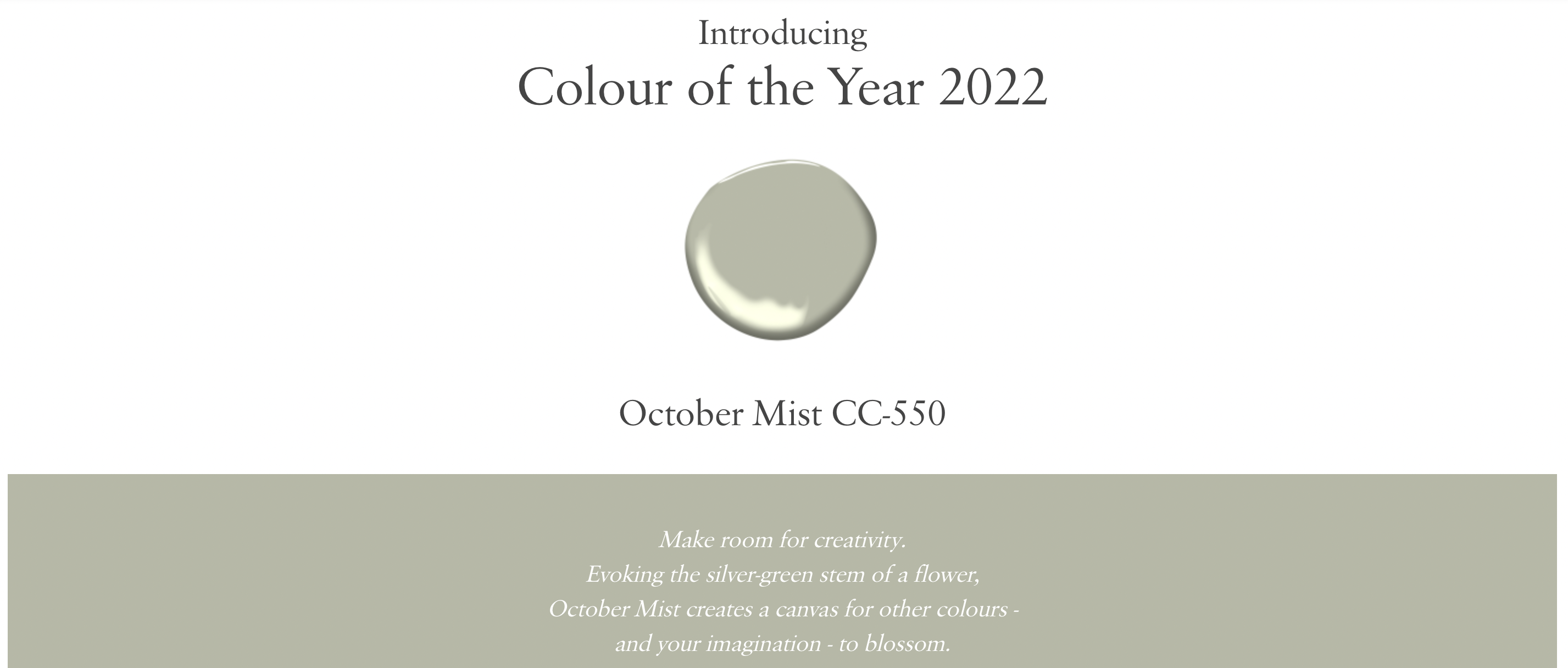
Image source: Benjaminmoore.com
Benjamin Moore’s colour of the year for 2022 is October Mist CC-550 a muted silver-green colour that follows the earth-tone trends of 2022. It may seem understated at first or like a simple beige, but if you look a little closer, you will see that unique undertones of this beautiful colour.
The great thing about a neutral colour like this one is that it can go literally anywhere in your house and look amazing. Whether you want to use it as an accent wall in your living room or to paint your master bathroom, this is the perfect choice for many different areas in your home.

Image source: benjaminmoore.com
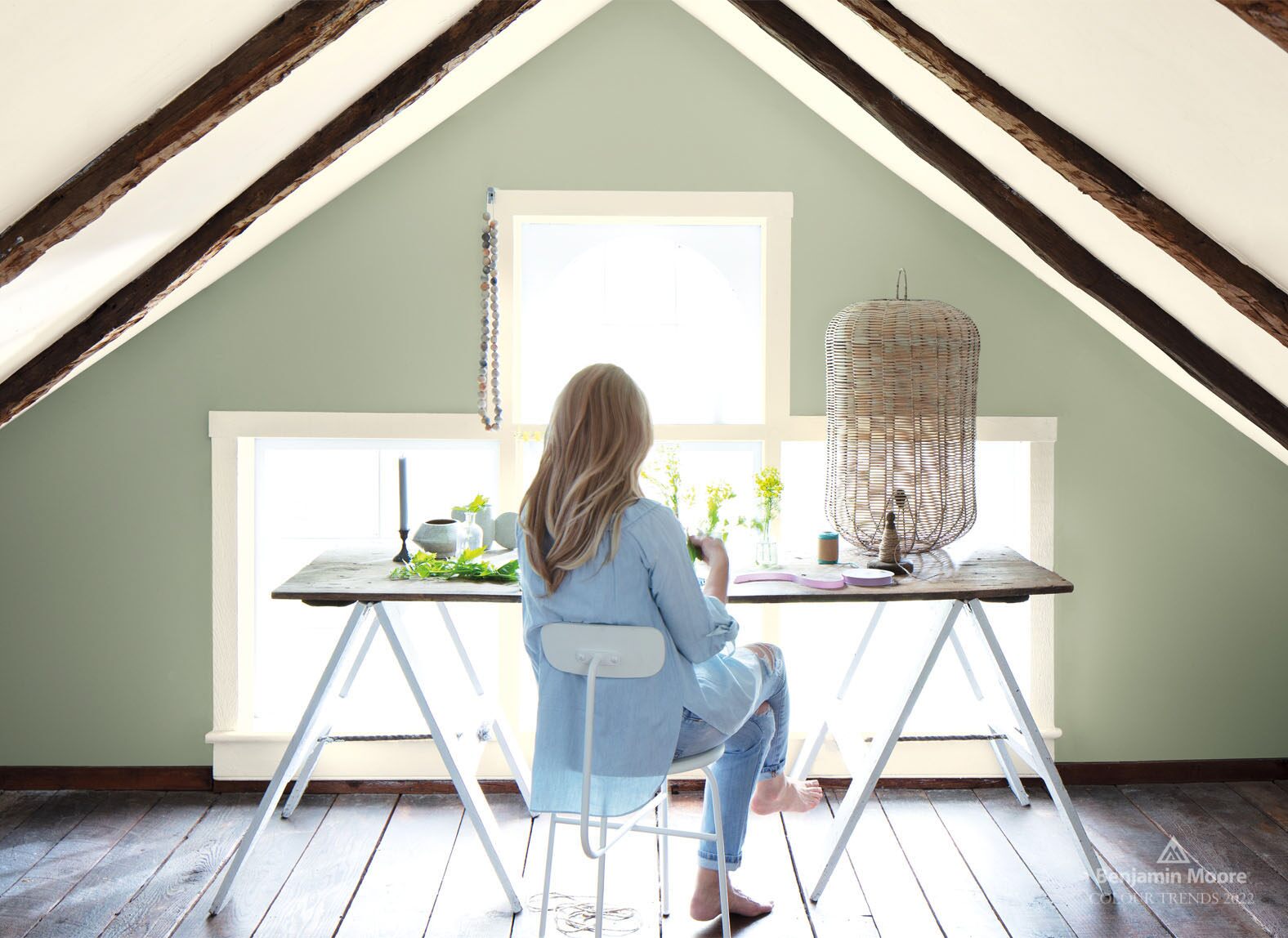
Image source: benjaminmoore.com
You can see from the display pictures above that October Mist can look a bit more beigey-silvery or a bit more green – like a muted olive green – depending on the light in your room. Regardless of the lighting, this colour brings feelings of warmth and calmness. Light colours are easy to apply anywhere in your home, so if you are looking for something a little different, this is a great choice.
Grey-Beige Tones
An office space painted in Benjamin Moore’s Revere Pewter
Beiges, greys, and similar beige-grey colours are not new. In fact, Revere Pewter, one of the most popular colours we’ve seen over the last few years has actually been popular for a while – see this blog post from 2013 gushing about Revere Pewter! This colour really rose to popularity around 2018-2019, but still remains an excellent choice in 2022 and the coming year.
Grey is in right now, and yet so are warmer grey tones. Revere Pewter is just one great example of how you can choose grey without sacrificing that warmth. In certain lights, the grey clearly shows its warm, brownish undertones. In other lights, it looks completely cool. Check out some other examples of grey-beige tones below.
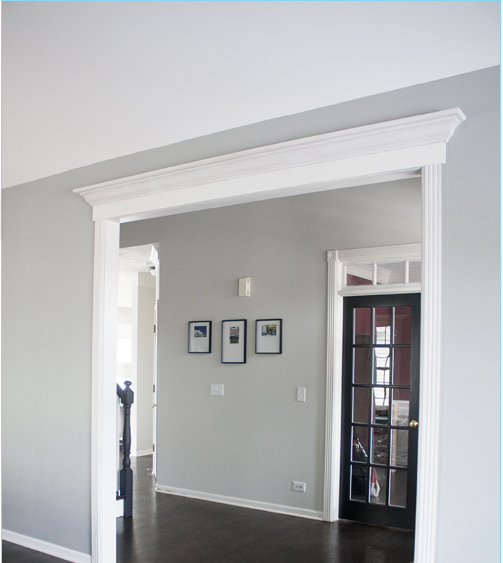
Image source: youresomartha.wordpress.com
Image source: kylieminteriors.ca
Unlike some other bold colours, Décor Aid emphasizes the fact that pewter and similar colours can be used throughout your entire home without concern about clashing colours.
“In fact, our interior designers suggest taking pewter paint color ideas throughout your home rather than just one room as its
one shade that works with everything, everywhere.”
Just as we mentioned with October Mist, a colour like Revere Pewter can be used really anywhere in your home. It is light and neutral enough that it will look stunning anywhere.
Dark, Leafy Greens
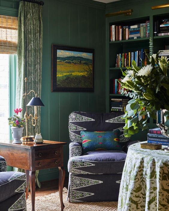
Image source: Pinterest.com
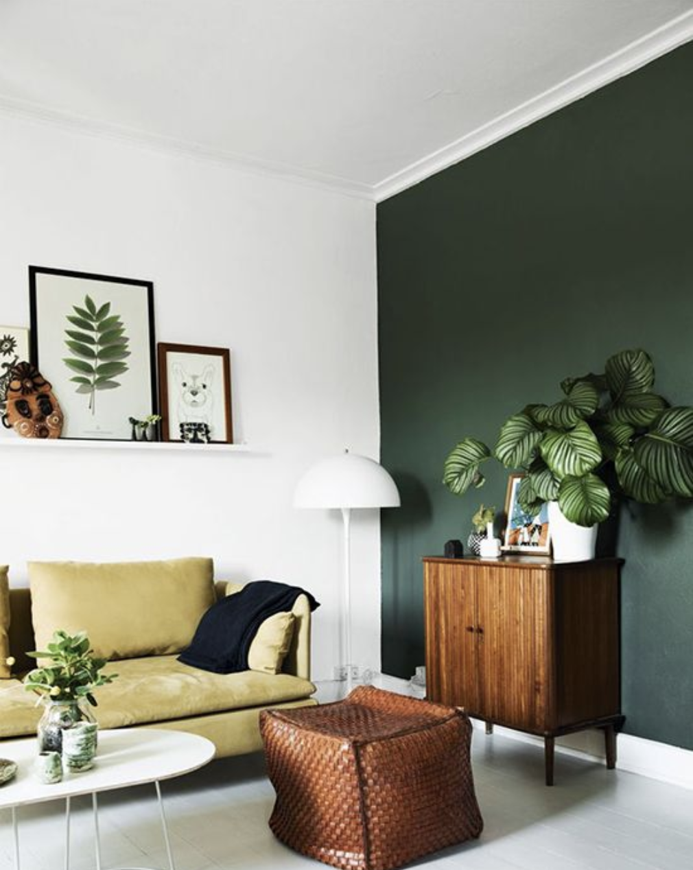
Image source: Pinterest.com
The Spruce has said that dark green is THE paint colour to have for 2022 – and we couldn’t agree more! Dark, bold, leafy greens have been trending for a few years now, but seem to really be picking up late in 2022 and into the next year.
Like coral, another colour that has grown in popularity recently, greens augment a retro vibe – especially when paired with real leafy potted plants, velvet furniture, and wooden cabinets and storage units.
A dark colour such as green is a bold choice, and some homeowners may find it a bit overwhelming. However, as you can see from the image on the right above, it works perfectly as an accent colour if you aren’t ready to commit to an entire green room.
Mustard and Purple and Clay, Oh My!
2022 is the year for embracing the bold. Though neutral colours such as greys and beiges are here to stay, we continue to see more experimentation with brighter and less traditional colours such as purples, blushes, and even bright, mustard yellows. Other variations of beige, such as clay, are also trending now. Take a closer look at these bold colours below!
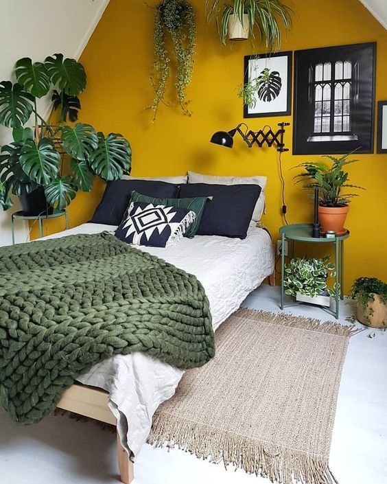
Image source: Pinterest.com
Brighten Up The Place With Mustard Yellow
“Somewhere on the color wheel between yellow and orange lives the perfect sunset shade. Dubbed mustard or marigold by design pros and paint experts, this warm color conjures up memories of groovy 70s interiors (hello, yellow appliances!). But the sunny shade has proven its staying power in recent years, thanks to its versatility as both a cheerful backdrop and a fun accent color.”
Yellows really do help brighten a room, and that makes them perfect for areas of the home that you spend a significant amount of time in, like your kitchen and living room.
Like other bold colours, you can choose yellow as an accent colour for a single wall, for a half-wall, or even for your front door for a small pop of colour!

Image source: Elledecor.com; Lowes
Feel The Luxury With Rich Purples
With Pantone’s colour of the year being a violet, periwinkle blue shade, we have seen a huge resurgence in purple. Purple may seem a bit outside of your comfort zone, but the image to the left really shows how beautiful it can be when paired with the right decor.
Remember, 2022 is a year of bold colours and new looks – so don’t be afraid to experiment with a colour a bit outside of your comfort zone.
If you aren’t too sure about how this colour will look with the rest of your home, try to choose all of your neutral tones first.
“Consider picking grays that have more tones of blues and purples to add even more richness to your design scheme.”
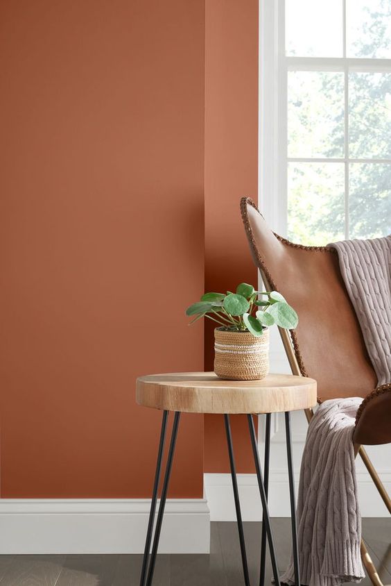
Image source: Pinterest.com; Sherwin Williams Cavern Clay
Get Back To Nature With Clay
Although browns may feel like a thing of the past, that is simply not true! MyDomaine talks about Terracotta being one of the most popular colours of 2022.
“I think the next big color trend we’ll be seeing is earthy shades of burnt sienna and terracotta. Grounding and vibrant at the same time, these red clay tones are going to add warm richness and sophistication to rooms in 2022.”
Elemental colours such as clay and reddish-brown paint colours are in this year, and they help bring a soft, warm feel to your home.
These paint colours may be a bit reminiscent of the early to mid 2000’s, but there is a modern spin to them and they definitely don’t look or feel outdated.

Now that you have an idea of what paint colours are popular right now, you may be wondering how to choose the right paint colours for you and your home. The colours listed above barely scratch the surface when it comes to your options – there are thousands of colours that you can choose from!
Before we get to that, let’s just take a look at some top tips for narrowing down your colour choices. First, take a look at this great video by Lowe’s that shows 7 quick tips for picking the right paint!
Some tips on picking the best colours from Lowe's
Though it can feel overwhelming when you hit the hardware store and take a look at all of those paint chips, we’ve got some tips to help you narrow down your choices. We’ll also go over more information on making sure you not only select a great colour, but that you select a colour you will love in Chapter 4.
How To Choose The Right Paint Colours - Top Tips
- Tip #1: Consider Your Furniture, Fixtures, And Decor: You may love the idea of yellow walls, but if you have a lot of purple in your home, the result may be garish. Of course, your style is your style – maybe you love the look of two colours that are known to ‘clash’ – however, it is important that you take a look at the furniture, fixtures, and decor that you plan to keep after you’ve painted. That way, you can make sure you choose colours that look great with your existing decor!
- Tip #2: Consider Your Other Wall Colours: Are you planning to paint one room, one level, or your entire house? This matters! If you are planning to paint a single room, you will want to make sure that your new colour looks good with existing colours. If you are planning to paint one level and are choosing multiple colours, you will want to make sure these colours don’t clash – and the same goes for your entire house!
- Tip #3: Use Inspirational Photos: It’s great to play around with colours and see what you like. One of the best ways to figure out your own personal palette is by checking out inspirational photos. Consider creating a Pinterest board of all the room styles you love, and then see what colour(s) the pictures you love have in common!
- Tip #4: Think About The Sheen: Paint colours are not just about the colour itself, but also about the sheen. The sheen of your paint will affect the way the colour looks when it’s on your wall, so don’t neglect to consider that! In general, areas that tend to get dirty or greasy more easily (e.g. the kitchen), choose a high-gloss sheen. For walls that have lots of indents or imperfections, matte will help ensure those markings don’t stand out!
- Tip #5: Take a Look At The Colour Wheel: If you are having a hard time choosing colours that you like, or aren’t sure how to avoid awkward colour combinations, find a colour wheel online. Colours opposite to each other on the wheel are considered complementary colours, and usually look great together. Colours right beside each other on the wheel are called analogous colours, and due to their similarity, usually look great together too! Taking a look at a colour wheel can help you find colours you like and help you pair them with others.

Now that you have narrowed down your colour choices, you’re probably going to want to make sure that you will actually enjoy looking at your freshly painted walls everyday! Liking a colour is one thing – but loving it, and wanting it in your home, is another. For these tips, we’ve turned to Stephanie Elizabeth, an interior decorator and former manager of a paint and design boutique.
We asked Stephanie about the best ways to make sure you’ll get a colour that you absolutely love – not just one that you’ll end up tolerating. Here were her top tips:
1. Test out the lighting in your room before painting!
This is the biggest one, whether that’s by grabbing a handful of paint chips of similar shades, or getting sample cans to paint a blob on the wall, or having the designer come in with the fandecks.
Lighting at different times of the day and in different directions and in different parts of the world will have different conditions – and lighting can make the biggest difference. a colour might seem grey in the store but turns baby blue when you get it home. so bring it home, test it out, and look at it for a couple days in different lighting conditions.
2. Decide on your ‘wow’ factor (your focal point)
Are your freshly painted walls going to be the main attraction of your room, or do you have a funky chair or fancy rug or something that you’re working around? Figuring out your focal point helps to make sure you don’t have too much colour or conflicting colours in the room.
Avoiding conflicting colours will help make sure you love all of your colours, including your new paint choice! If you are focusing on an item, such as accent pillows or artwork, you can bring the cushion or the artwork or whatever that piece is into the store, or if the designer is coming to your house, they can look at it and help pick out colours that complement it.
3. Try to keep it neutral
Of course, not that every colour has to be grey or beige, however, having a grey undertone to a colour will make it more tolerable for longer. Your eyes will eventually get tired of looking at a bright colour for too long, so for example, a dusty rose will last longer than a bubblegum pink. if you want a specific colour (red, blue, green, purple) then find one with a neutral undertone. This will help make sure you don’t get sick of it anytime soon.
Keep in mind it’s also important to choose what you like. Don’t pick a neutral colour just because someone told you so. If you want to go bold – that’s okay. Remember, you can repaint your walls if you don’t like the colour. Choosing a colour you’ll love is important, but so is experimenting – and sometimes we learn what we like (and what we don’t like) after the fact!

Not sure what paint to pick for your kitchen, or your bedroom? What about your bathroom? Of course, in the end, it’s all up to you. But if you’re wondering what are the most popular colours for the three ‘main’ rooms in your home, you’ve come to the right place. Remember, the colour you paint your room can completely affect the tone!
Best Colours For Kitchens
Most people start their days off in the kitchen. The saying “the kitchen is the heart of the home” definitely has truth to it – it’s where you eat your meals, open your mail, write on your laptop, enjoy the company of friends and family.
Because the kitchen is such a well-used room in many homes, the best kitchen paint colours are ones that energize but are neutral enough that they won’t make guests feel uneasy! According to HGTV, the best colours for your kitchen include:
- White and Grey – Subtle, bright, and neural, white walls and grey walls both feel clean and bring feelings of comfort. You can also add an accent wall, or bright and colour wall decor to add a touch of colour!
- Blue – Take a note from our popular paint colours and consider a steel blue for your kitchen. It will bring a bit of an industrial feel, and looks perfect complimented with wooden countertops.
- Yellow – Who doesn’t love a kitchen full of sunshine? A yellow kitchen can make your home feel sunshiney all the time!
- Green – Another great opportunity to try out a trending colour, green kitchens are in. They give a bit of retro vibe too!
- Red – A bold and bright colour, red may not be one of the most popular colours right now, but it is a classic choice for kitchens and always helps to bring a warm feel when done right.
Best Colours For Bedrooms
Your bedroom should be a comfortable, cozy place of retreat at the end of the long day. Most people will want to avoid overly bright colours, such as bright yellows and reds, as they can potentially disrupt your sleep and may not help bring that ‘cozy’ vibe you’re looking for (however, darker versions, such as mustard yellow, may work well for you).
Like all other rooms of the house, before you choose a colour, you will want to take a look at what already exists in your room. This is especially true for your comforter – you wouldn’t want to paint your walls a colour that completely clashes with your existing bedlinen!
To help you out, we’ve taken a look at Decor Aid’s top colour choices for bedrooms, and have listed out some of the top picks outlined on their site. Some of the best bedroom colours include:
- Green Blue – An ideal gender-neutral colour, green blue colours are soft, cool, and perfect for children’s and adult rooms alike. This colour pairs well with dark woods and blush pinks, so if you’ve already got some furniture that coordinates, you may want to consider this colour!
- Greys – Greys are always a great choice for the bedroom as they are ultra-neural. If you want to spice your grey up a bit, consider a grey lilac, which has undertones of purple. It will provide a hint of colour without feeling too bold.
- Earth Tones – Greens, browns, and clay colours are in this year, and they will look great in your bedroom. Neutral colours are often preferred in the bedroom, and while earthy tones are neutral, they definitely help bring a natural, outdoorsy vibe to the room.
Best Colours For Bathrooms
With the right finishing touches, your bathroom can feel more like a spa – no matter how big or small. Choosing the right paint colours can help you achieve your desired look, whether you want a relaxing oasis or a bold, bright, fun kids bath.
Because the bathroom is a small space, it’s a great opportunity to test out new looks. Bold and unique colours and patterns won’t feel overwhelming when placed in smaller places! White and greys are always a good look too, of course. Architectural Digest has outlined some of the best choices for the bathroom, including:
- Black – Black is a difficult colour to do right in large rooms. However, in a bathroom, it can be easy to play with! Consider painting half a wall black, or adding a black accent wall – it’s a powerful choice that pairs perfectly with your white porcelain fixtures.
- Warm white – White with a touch or beige of brown will help bring a warm feel to your bathroom. Plus, it’s a super easy colour to match with existing towels, decor, and fixtures.
- Pink – Pink is definitely a bold choice, and as we mentioned above, the bathroom is the perfect place to take risks! Many homeowners want their bathroom to feel warm and relaxing, and pink is a great choice to get that feel.

No, you’re not imagining it – certain colours can make you feel a certain way, often without even realizing it. Because we know about the psychology of colours, this is another important thing to think about before you choose your paint colour. Take a look at the colour chart below by The Logo Company. Although this chart was originally intended for those thinking about branding and marketing, the same ideas apply to paint colours too.
For example, if you want your kitchen to feel warm, cozy, and bring optimistic vibes – consider bright or mustard yellow. Or, if you want your living room to feel cool and secure, consider a shade of blue. Check out the chart below to learn a little bit more about colours and their tie with emotions.

Source: thelogocompany.net

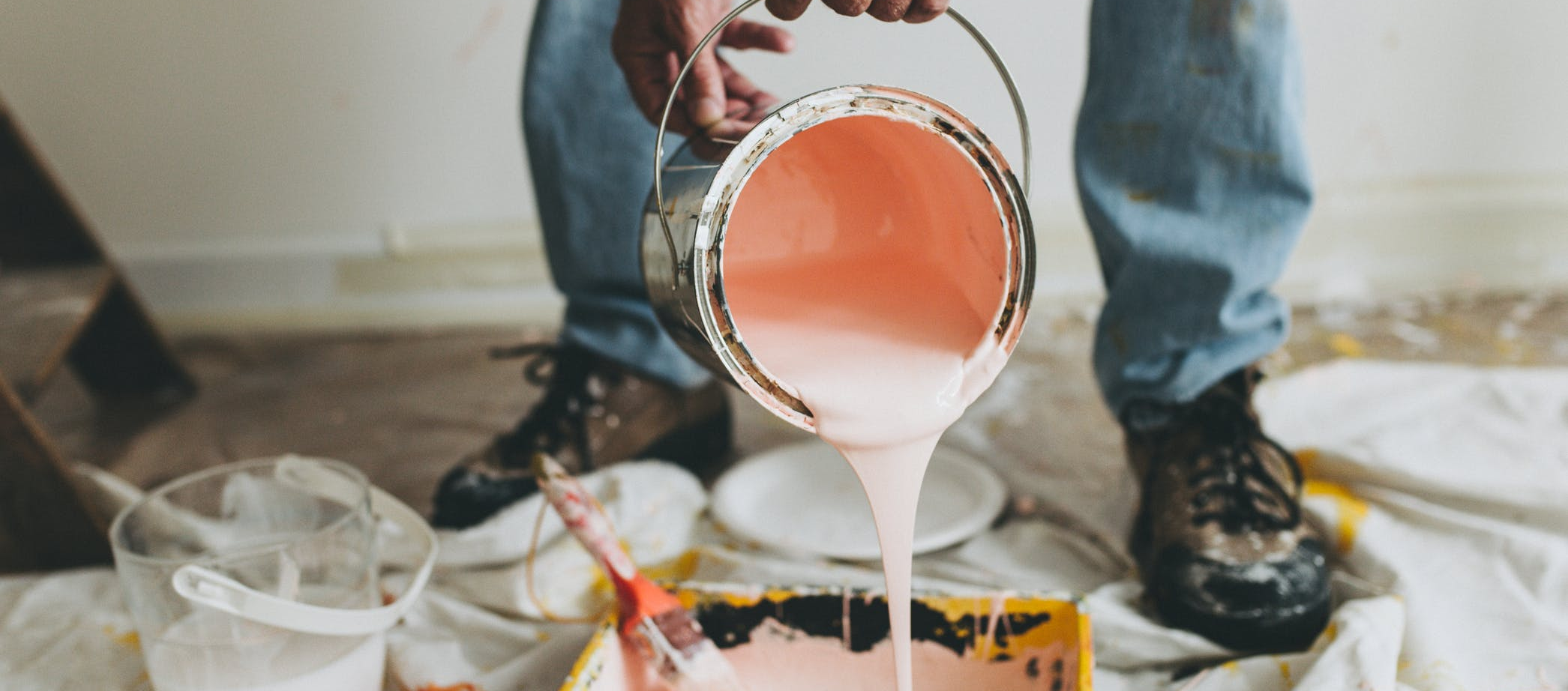
As you begin to narrow down your paint colour options, the next step will be to go out and grab some paint chips/colour samples. Decide on the store you want to purchase your paint from, and head on over. You will usually find hundreds of free chips that you are able to take home with you!
Your paint chips are a valuable resource, but they can also be a source of stress if you don’t choose wisely or even know how to properly use them! See some paint chip do’s and don’ts from House Painting Tutorials to help you get full use of them!
Paint Chip Do’s
- Know the sheen you want – and ensure all of your paint chips have that sheen! If you want matte, there’s no point going with a satin or gloss finish paint chip. Matte and gloss paint, even of the same colour, will look very different when actually painted on your wall!
- Compare the paint chip with other elements in your home – not just your walls. Hold it up to your couch, your curtains and blinds, your favourite funky chair, your wood floors or carpet, etc. You want to make sure that the colour not only looks great on your walls, but also looks great with the rest of your existing decor and fixtures.
- If you get a paint sample, ensure that it has at least 24 hours to dry on the wall before making a decision. Paint does not look the same wet as it does when it’s dry!
- A bit of DIY for you – grab a bunch of the same paint chips and then create an oversized swatch to place on your wall. Paint chips are small, and it can be hard to envision what your walls will look like based on a single, tiny square.
Paint Chip Don’ts
- Don’t rush the selection – if you do, you may end up getting colours that weren’t exactly what you wanted! Then, you’ll have to go back to the store, probably feeling a bit frustrated!
- Don’t skip over the sample step. It can be tempting to work off paint chips alone, but you really won’t know what a colour looks like until it is painted on your walls. It will probably cost you a few extra dollars, but that is definitely worth it to have the peace of mind that you’re selecting a colour you will love!
- Don’t limit yourself, but don’t go overboard either. You will want to bring home a variety of paint chips and test them all over different lights and areas of the room. However, you don’t want to overwhelm yourself and bring home too many! Around 5 is generally a good number.

Finally – you have narrowed down your colour choices, got your paint chips, applied your paint samples, and picked the perfect colour for your home! Now it’s time to paint. Painting can feel like a daunting task, especially if you haven’t really done it before. Although painting is actually one of the easiest home ‘renovations,’ it does require some know-how and a bit of skill if you want to avoid streaks and paint drips all over your wall!
The best way to learn how to paint is by watching someone else do it. Even with the most extensive how-to guides, nothing beats seeing exactly how it’s done. The video below by Nifty 101 is a 15-minute long how-to video, and includes everything from choosing your paint colours to the final clean-up. If you want to only watch the how-to-paint section, jump to timecode 8:16.
However, we recommend you watch the whole video if you have never painted before – it goes over some of the same tips we’ve listed above, but gives great examples as the narrator herself looks for a new colour to paint her living room/dining room.
A simple guide for painting a room
If you are less of a visual learner and prefer to read how-to guides, here are a few that you might find useful as you prepare to paint your home:
- How To Paint a Room – Lowe’s
- 10 Things You Should Know Before Paint a Room – Freshome
- 10 Interior House Painting Tips & Painting Techniques for the Perfect Paint Job – Family Handyman
- How To Paint a Room For Beginners – Graham & Brown
If you have not painted before, make sure you take the time to read through one or more of these guides, or watch a how-to video. It will only take a few more minutes or your time but can make a huge difference when it comes to the final look of your walls!

Here are a few final tips and pieces of advice from Lowe’s that we have gathered to help you out before you get started on your painting project.
- Not sure how much paint you’ll need? Not buying enough paint or buying way too much can both be frustrating. Check out this paint calculator by Lowe’s to get a better idea of how much you will need!
- Don’t forget to prep beforehand – you will want to make sure you have painter’s tape, tarps, or even old newspapers to help catch spills and keep your floors and furniture safe!
- If you are painting the ceiling as well as the walls, always start with the ceiling first. Typically, it’s best to paint from the ‘top down’ – start with the ceiling, then get to the walls, and finish with the trim/baseboards.
- When you ‘cut in’ (paint the edges of your walls, which should be done first!) keep a small paint bucket with you on your ladder instead of the huge paint can. This will help avoid spilling an entire can of paint. Plus, a small bucket is much easier to work with.
- Don’t know how to hold a paint brush? Hold it the same way you would hold a pencil!
- If possible, paint with two people. Painting will go by much faster if you have one person cutting and the other person rolling!