Would you like to learn how to pick colours for a room that will look good together? You can by following a few simple guidelines. Read on to find out how to choose the perfect colours to complement your rooms and make them look amazing. For expert interior design advice, contact the professionals at Graham’s & Son today. We will come to your home for a no-cost consultation and help you choose just the right colours, window treatments, flooring, and accessories to make your room shine.
How to Pick Colours for a Room that Will Look Good Together
You too can learn how to pick colours for a room that will look good together. Here are a few basic rules to follow to make your rooms look like they just stepped out of a designer magazine.
A Basic Rule of Thumb for Colours: 60 – 30 – 10
Balance is the key when choosing a colour palette for your room. By following the rule of 60-30-10 you will create a beautiful balance of hues to rival any designing magazines! Start by selecting three colours in the following proportions:
- Dominant colour: Use this colour for about 60% of your room
- Secondary colour: Use this colour for about 30% or your room
- Accent colour: Use this final colour for about 10% of your room
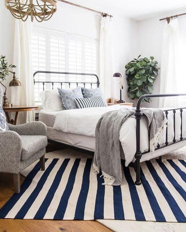
You don’t have to be exact in your proportions; simply use your dominant colour in the majority of the space, your secondary colour in about half the amount of space occupied by the dominant colour, and then the accent as your splashes of colour. You could also go with two different accent colours, using each in about 5% of your room. The gorgeous bedroom below found on Pinterest, originally pinned from Maison de Pax has white as its dominant colour, soft grey as its secondary, and then has navy and green accents.
Use an Analogous Colour Scheme for a Comfortable Feel
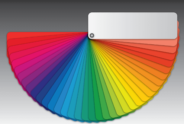
If you would like to create a really comfortable mood or feeling in your room, especially if it is a bedroom, then you might want to go with an analogous colour scheme. Analogous colours are those that are next to each other on the colour wheel, like blue and green or orange and yellow. Because they are close in appearance they tend to create a sense of serenity and relaxation. These types of colour schemes are often found in nature and they are quite harmonious and pleasing. You need to have enough contrast included in your room, however, to break it up a bit so that it doesn’t become monotonous. Choose one colour as your dominant one, for example, blue. Then use a darker green as a supporting colour. Finally add in a third, lighter green as your accent colour along with white, gray, or black to break it up a bit.
Get Inspired by a Favourite Item in Your Room
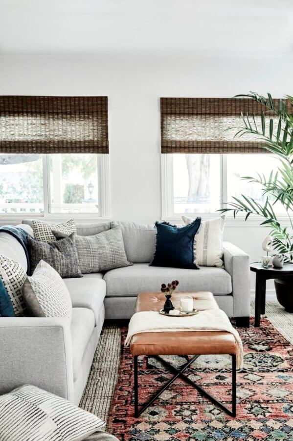
Get inspiration for the colour palette for your room by taking a look at what is in your room. If you have a large painting or piece of artwork, a patterned area rug or some upholstery with a design in it, choose some colours from one of these prominent pieces to use in your room. Try to choose an object that you really like and then you will probably be even more satisfied with the end. To get the right neutral hue for your wall paint, use the same shade of white or beige in the chosen piece’s pattern. The following room design from Planete Deco has taken the deep slate blues and greys from this beautiful area rugs to use as accent colours in the room. The walls have the same neutral soft grey as the one from the rug as well. This is a very clever trick for tying all of your colours together.
Take Some Advice From Nature
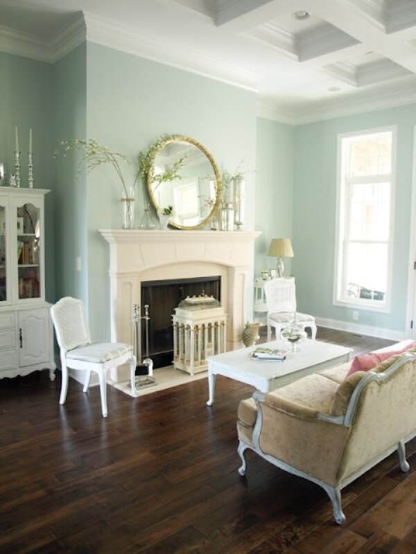
Designer Mark McCauley suggests taking a look at the nature around you to choose the colours for your room. In nature, the colours under our feet, such as the ground itself, tend to be the darkest; those that are above such as the flowers and trees, are medium shades, and the sky above is the lightest. Using this pattern, put your darkest colour on your flooring, medium shades on your walls, window treatments, and furniture, and then the lightest tones above you on your ceiling. This living room found at favething.com shows how well this principle can work. The deep, rich tones of the hardwood help to ground this room. We love the choice of a medium soft green for the walls. This colour is called “Rainwashed” and it comes from Sherwin-Williams. Finally, the light and bright ceiling gives the feeling of additional height.
Black Can Make a Great Impact
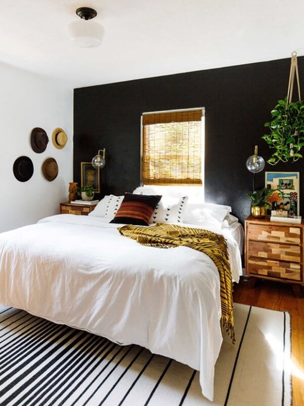
According to designer Mark McCauley, black can be a great addition to any room. The black can help to clarify the room’s other colours. It will definitely give definition to your space. You can use a little or a lot depending on the impact that you would like to make. Adding a black lampshade or ornament can give just enough definition or you can go even bigger by adding a black piece of furniture or painting some of your cabinetry black. The room below from Casa Vogue Globo has used black to make a bold and effective statement. The accent wall, pillows, throw, and area rug all incorporate black for a wonderfully chic and sexy look.
Additional Information
If you have little or no experience painting a room, here is a great video that will give you some great painting tips.
This helpful video explains how to choose the right type or sheen of paint for your room.
“Dear Mr. Wayne Graham, May 2016 be the best year for the Grahams and their company! I must take this opportunity to thank you for the renovation job done on my house, not only the input idea that made my home more modernized, but the skill work that made the job done perfectly. I will not hesitate to refer you to my friends who may need a renovation on their house. Thank you again and have a healthy and prosperous year in 2016. Yours Truly,”
– Daniel Yu
Read more customer testimonials
Remodelling Your Home? Contact Graham’s & Son Today
If you are considering remodelling or renovating your kitchen, bathroom, or any other room in your home and need some help, talk to the design experts at Graham’s & Son. Graham’s & Son has been producing beautiful interior designs for more than 40 years. We are locally owned and operated and we specialize in all types of renovations. We offer free, in-home consultations and will take the time to listen to your ideas and dreams for your space. If you are thinking of remodelling your kitchen, bath, or any room in your home, contact the professionals at Graham’s & Son to book your free in-home consultation today.
Our customers have been so pleased with the high standard of our work that they selected us for the “Best Business Service – Interior Decorating: Platinum” and “Best Shopping – Kitchen Renovations: Gold” awards in the 2017 Cambridge Times Readers’ Choice Competition. Book a free in-home consultation today and find out for yourself why Graham’s is the best in the interior design business. Contact us today to schedule. If you prefer, you can shop at home. Browse through our website, make your choice, and simply give us a call at 519-658-9025 to place your order without ever having to leave the comfort of your own living room.
 |
 |
Source:
15 Designer Tricks for Picking a Perfect Color Palette
Favorite Way to Choose a Color Scheme
Color Harmonies


